It works out at about 6 and a half minutes for the entire presentation. Mine factored in my animatic as well, so it was 3:40 for the animatic and the other 3 minutes worth of slides.
For more info check out the website here: http://www.pecha-kucha.org/what
I was a little surprised how fast each slide went past in my presentation, I had more to say but 20 seconds is a lot shorter than it sounds when you're talking, so I had to move on and skip a few points.
This is the animatic I prepared and showed at the end of my presentation. I was fairly happy with it the day before, but seeing it on the bigger projection screen drew attention to parts that were too 'cutesy' such as reaction close-ups or dramatic like the storm or the particular Michael Giacchino score I picked for the middle which was just too much.
My feedback for the animatic itself was very critical, which it of course needed to be:
- The girl's proportions are perhaps too old for the story, and if so she needs to start younger in the beginning
- It plays out too much like am epic scene from a feature film rather than a concise short
- The Spirit design is just too generic and ghost-like (Casper) my lecturers were expecting something more free-flowing and ethereal
- Mise-en-scene is lacking and I could be more experimental with exploring the space and changing angles/composition
- Ultimately it's too cute and saccharine like this
I was disappointed there were no or little positive comments, but I plan to take the criticisms on board and bounce back in my next animatic, but still consider that it is opinion and I need to do what I think is best for my film.
The week following my presentation, I took a step back from work and just thought about my idea and wrote down my thoughts and feedback and booked tutorials with my lecturers and spoke with my family and friends about where to go next. I wrote down my current story like this:
Spirit is lonely. Spirit meets girl. They form a friendship over the years and seasons while Spirit waits for planted acorn to grow. They part ways at the end of a day and a storm rolls in. Girl worries in her room then heads out into storm to find Spirit. Spirit tries to warn her to go back inside, but a branch on the tree snaps sending the girl falling and lightning strikes the tree. Next morning, the girl wakes up to devastation, she despairs when she can't find the Spirit. Suddenly a squirrel appears to show her the new sapling that is growing and Amber is able to move on from the loss of her friend.
Essentially nothing really happens in this version, there is no conflict between characters and the squirrel confuses the audience as to whether it is the Spirit in a new form and how can she move on to a new friend so quickly anyway?
I took out the squirrel and wrote this:
Girl is lonely. Spirit befriends girl. Girl revisits Spirit every day throughout seasons to spend time with her friend. She grows older as time goes past. One day a storm appears overhead and the girl has to go home. Spirit is left alone. Lightning hits the tree overnight. Girl comes back and is shocked at devastation. Unable to find her friend, she despairs, but a tiny sapling she discovers is enough to give her a new hope.
Although simpler, it's still lacking crucial turning points and is just "this happens, and then this". I discussed this with my friends and fellow animators and they noticed that I wasn't showing Amber's faults in my story. I've written her as a selfish and sometimes arrogant girl, but this never comes across and there is no clear character arc.
Jessica Leslau suggested that I look at character diamonds such as the one below. It's important to put down your character's strengths and flaws to make them more believable and relatable. I'll be posting my own version for Amber and the Spirit soon and definitely incorporating their flaws into my story itself.
For more info on character diamonds, see here: http://melissaleavitt.blogspot.com/2007/06/character-diamonds-are-writers-best.html
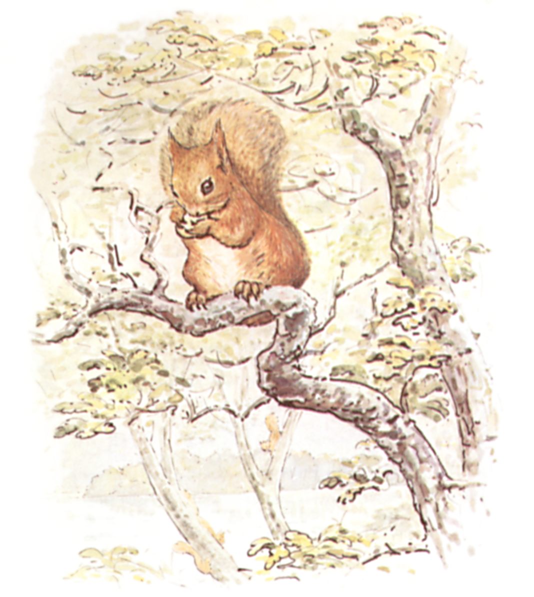
My film was also criticised for looking too American. I didn't know where this impression was coming from until my friends pointed out Amber's dungarees. Although I wore them as a child, many American 90's family films show children wearing dungarees and could easily give that impression, and there is nothing in my film that is specifically British, so I'm changing Amber's design using reference from my family photos and aim to have a shot in her bedroom in the film to show more British influences in a SUBTLE way of course.
 |
| Kirsten Dunst in Jumanji (1995) wears typical denim dungarees and pigtails, which is too much of a 'perfect American girl' image for my film. |
 |
| Winnie the Pooh and Rabbit illustrated by E. H. Shephard |
 |
| Squirrel Nutkin illustrated by Beatrix Potter |
Next I'll be posting my new story synopsis as well as feedback from tutorials with my lecturers, James Manning, Matthew Gravelle and Leonie Sharrock.

No comments:
Post a Comment