Saturday, 31 December 2011

Watercolour Concept Art

Since my rediscovery of using watercolour, now with the ability to paint without permanently crinkling the paper, I have taken the technique to some new concept art for Acorns. Using some new A3 watercolour paper, I sketched out some new and old character poses on one sheet and character expressions on a second sheet and did some pastel watercolour washes over it.


I'll be using the expressions sheet as reference for some of my character performance later on. They were largely inspired by character sketches by Hayao Miyazaki in art books for Kiki's Delivery Service and Ponyo and Oliver Jeffers gorgeous watercolour imagery in his children's books.

The Art Of Kiki's Delivery Service

Oliver Jeffer's Lost and Found
I love the storybook quality to using watercolour with pencil sketches in this way and would love to do this for an entire illustrated book of my film... if I only had the time! I've really enjoyed using watercolour and may introduce it further in my film for backgrounds or at the very least using the bright, pastel-like colour palette for my digital clean-up and colouring.

More to come in the new year! :)

Friday, 30 December 2011

Knitted Dragons Concept Art

NOTE: This post is unrelated to my film, but is additional evidence of my work and character design for a fellow animation student.

These are concepts and character designs for my friend and fellow student, Robert Morgan, for his film about knitted dragons.

http://knitteddragon.blogspot.com/

The purpose of these was to design Rob's character, Alex, and the dragon she battles in his film. The film is in full CGI so it was important to be accurate with the drawings and show the characters from several angles.

These were done between late November to December 2011 (Newest at the top)


Model sheets show up many problems in design before going on into the modeling stage of CG in Maya, to cause even more trouble. Issues such as showing Alex's emotion with dot eyes and without eyebrows, moving her short arms convincingly and the dragon moving from all fours to standing upright. 


Alex Style Experimentation


Below is early development that was altered to better suit Rob's style of Maya modeling. While this was adequate for 2D animation, it was not relevant to stylised CGI, being too naturalistic and organic. What was needed was more geometric symmetry and a less realistic approach to character design.


Early Alex Development

Early 'squirrel-like' Dragon Development

Early 'squirrel-like' Dragon Development

Early 'squirrel-like' Dragon Development
Rob is now modeling the characters and experimenting with colour so my assistance with his designs are over for now, but more drawings may be required later and I will give him feedback for how my model sheets have been interpreted. More on that in the coming months.

Thursday, 29 December 2011

Christmas Watercolours


For Christmas I've done my friends and family some watercolour cards, it's been very fun and enjoyable to experiment with watercolour which I haven't used in years. I've posted these to show my development in using this technique as I plan to extend this into my production art, inspired by watercolour art by Hayao Miyazaki.

These were for my friends: classmates and housemates...


From left to right:

Jessica's Mollie and Babbit http://arabbitcalledbabbit.blogspot.com/
Robert's Alex and Knitted Dragon http://knitteddragon.blogspot.com/
Paul's Direwolf 'Snow' (Game of Thrones)
Zara's Roberta and Emileena http://thezukineework.weebly.com/
Bryony's Pond Creature http://utopiaofthepond.blogspot.com/
Dale's 'Zommer' (Moshi Monsters)

These were for family:


From left to right:

Alex's Link and Zelda (Nintendo's Skyward Sword)
Grandparent's Giraffes
Eleanor's Babbits, Ebony and Eddie
Emily's Cloud (Square-Enix's Kingdom Hearts)
Dan's 'Wookie the Chew' James Hance homage http://www.jameshance.com/
Sarah's dragon-esque My Little Pony
Uncle and Aunt's African Lion
Mum's old dachshund, Pippi

More watercolours to come soon! Merry Christmas and a Happy New Year! :)

Thursday, 22 December 2011

Cartoon Saloon Inspiration

Found some lovely animated snippets yesterday from Cartoon Saloon who made The Secret of Kells (2009) on their channel on Vimeo. The first one has a rough, textured pencil quality to the lines which you see rarely in 'cleaned' animation. Although the style is different, the line quality is very similar to what I am aiming for so is useful reference. The second I find very simple and sweet and features a young girl and a tree, so again, ideal inspiration for my film.


From Darkness - Promotional Trailer (By Cartoon Saloon) 


Greasai Blog (By Cartoon Saloon) 

Tuesday, 20 December 2011

Rough Animatic VI

This is the animatic I showed for my Production Bible presentation. This is the last rough version I'm doing, the next will be a digital rendering that is much clearer and will have shaded backgrounds and colour-coded seasons. Some story points will change and the character designs will be more finalised, and possibly with different music, but otherwise this is the main intent of my film.


Also, the working title is now "Acorns".

This will possibly be my last post until after this weekend, if so, Merry Christmas everyone! :)

Production Bible Presentation - 12/12/11


Last Monday, I presented my Production Bible to the rest of my class and tutors. My Production Bible was a collection of my art showcasing what my film and characters would look like and contained my latest animatic, synopsis, schedule, budget, storyboard and other information that is necessary to make my film. Basically it should be enough information about your film (visual + written) that if you were not able to make it, the bible could be passed to someone else to finish, so it has to be very detailed and really thorough.

The presentation went well, it was only 5 minutes so it was just enough time to show my animatic and go over my new model sheets. My main points of feedback were about aesthetics rather than story. The points raised were mostly about the look of my Spirit character, that it was too much like an animal hybrid rather than a spirit. However, my inspirations are Japanese and Celtic-based that use animals as spiritual creatures, so I don't think an animal hybrid has any inherent problems. I will need to clarify with my classmates and tutors after Christmas what their idea of my Spirit is.

My next step is to animate my Spirit moving in the current design to prove that, when moving, it will appear otherworldly. The main aim is to get it looking 'morphous' and plasmatic. One suggestion was that it could morph between different animals, but I think that is too confusing for a short film and would require further establishing.

Otherwise, I could have it so that the Spirit could fly, float or jump to high places (i.e. top of the tree) and that it can't leave footprints in the snow like many Gods can walk on water. I had another thought that the Spirit could morph from two leaves on the tree that then become the Spirit's leaf ears, so lots of fun to be had there.

The only story issue was to do with my ending. The Spirit returning so early to Amber did not make sense... it made more sense to have her plant the last acorn first, then the Spirit is reborn from the ashes, so to speak. I think this would make a better ending and a stronger emotion with the Spirit returns to Amber.

Also, James thought my pre-visualisation was a bit dark and that I should be using the more pastel-like colours of my colour tests, so I've made a lighter and sketchier version of my pre-vis (that I much prefer) below.


And good news for my soundtrack, I'm currently emailing a prospective composer, Ben Rusch, about creating the final score for my film, I'm very excited to be working with him and hope to have some rough sound for my next animatic deadline in January. So that's one thing out of the way!

Finally, as seen above, my working title has now changed to 'Acorns' thanks to a suggestion from Leonie.

Toon Boom Experimentation

In our last refresher workshop of the year with Stan, we went over the basics of "Toon Boom" as the last time we had used it was back in first year. Toon Boom is great for digital animation and crisp, clean animation. I did a couple of tests in it to see how the 'paint and trace' methods of turning my line art into a vector image would effects my sketches.

These were the images I used:


Adjusting the paint and trace tolerance and settings turned the lines into this:


The vector is useful in that it allows you to enlarge or shrink the artwork without effecting quality, and you can easily drop in colours and gradients that fit perfectly with the edge and without worrying too much about broken lines. However, because it doesn't record the 'greys' and other values in my lines, the result is two-tone and high-contrast which is the opposite of what I want my lines to look like. Nevertheless, I enjoyed the results of the method and think it would make a very unique art style sometime in the future, so I coloured it in too.


Finally, I tried out a simple tail-wag cycle for my Spirit, using only a mouse in Toon Boom, so it is very rough! The tail doesn't move how I want it to in my next animation tests, but it was a fun start for a little workshop exercise.


All-in-all, I enjoyed the program and can see it's benefits, but it's not what I'm after for my final film, so I'll be sticking to pencil and paper and Photoshop.

Monday, 12 December 2011

Concept Art and Pre-Visualisation

I wanted to try some watercolour to compare colours for the seasons for the Oak tree, with reference to Oliver Jeffers and My Neighbour Totoro and Ponyo for colours.

I particularly like how the colouring for winter has turned out and plan to do more of these over the Christmas break.


And here is a pre-visualisation test using rough pencil lines and digital colouring. I dropped in a sketch of Amber and the Spirit as well to see if they fit with the background style... I think it works quite well!

Storyboards

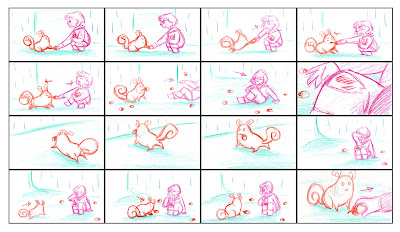
I've compiled the storyboards for my animatic into grouped images for presentation and production bible purposes, it's also much easier to upload them in compilations that individually!

They aren't captioned or anything yet, but hopefully they are still readable in this format.


Budget

I've made a rough budget for my film in Word to list my purchases and future expenses on my film. Being a 2D pencil animated film, it won't be as expensive as a stop-motion film and most purchases will be on paper and pencils, but I am also factoring in the possibility of needing a professional Chromacolour lightbox, as the lightbox I have now is only an A3 one from Argos and the lightbox facilities at the city campus may become too busy over next semester, so I am considering getting my own lightbox.

Other than that, expenses aren't too bad and are easily covered by my student loan.

Model Sheets - Seasons

For my Production Bible, I drew some more model sheets for the costume/colour changes for my characters over the seasons.

I've changed the colours for "Autumn" slightly and experimented with changing the Spirit's colour for each season. I think "Winter" and "Summer" came out well but I'll try out some extra colour schemes to see what works best between characters and against the background too.


Original uncoloured versions:


 I also coloured in a couple of my sketches as character pictures for my production bible. I particularly like giving Amber primary colours and having the Spirit as the only character who is green and therefore in sync with nature.


Schedule

In our Monday seminars a couple of weeks ago, Caroline Parsons suggested we get some production schedules done for next semester. I have been reading a production design book by Hans Bacher called Dream Worlds: Production Design for Animation which had this really helpful graph roughly plotting the production pipeline for an animated feature made in 18 months.


I used this as a template to make my own production pipeline, but condensed it to a 9 month schedule for my film.


 Once I had done this, I went into Microsoft Excel to make a more detailed Production schedule, referencing my blog, calender and notes to input the dates for my work thus far and then roughly plot the work I'll be doing next semester with room for contingency time on weekends and Dissertation writing and deadlines.

It took a lot longer than I originally thought, but it is much more detailed than the pipeline and goes from the start of year in September, right through to our deadline in May.